At Josef, I worked on a no-code platform used by legal teams to build and manage automated workflows.
The product is used to structure complex legal processes, which are often detailed, multi-step, and difficult to standardise. My work focused on making these workflows easier to create, understand, and manage, especially for users without a technical background.

During my time there, I worked across key parts of the product, including:
A lot of this work involved working through complex edge cases and making sure the product remained consistent and usable as new functionality was added.

A closer look at a couple of projects:
Restructuring workflows to make complex logic easier to follow →
Supporting document automation without breaking formatting →

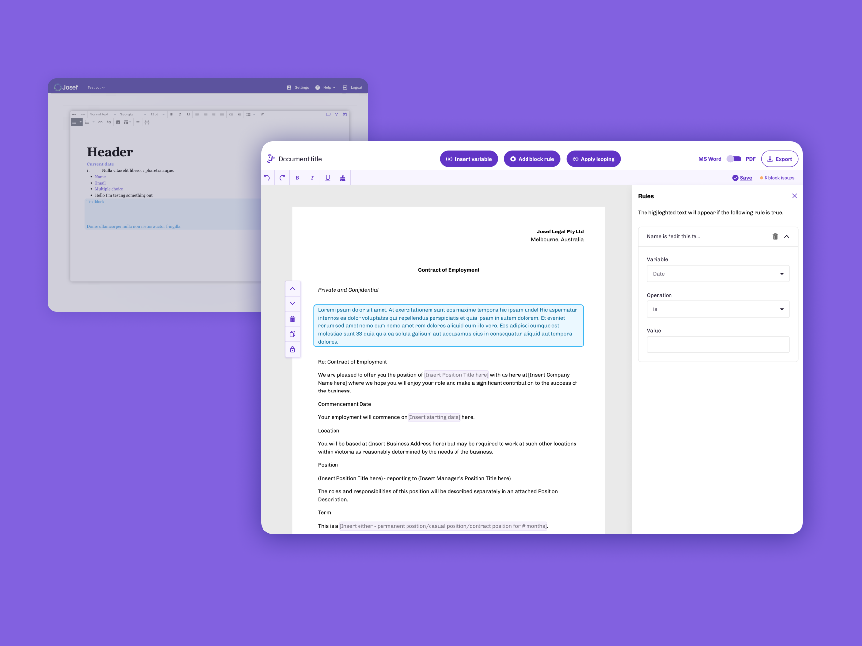
At Josef, the flowchart builder is a core feature used to create automated workflows using decision tree logic. These workflows power chatbots used by legal teams to guide users through complex processes.
After releasing a beta version of the flowchart, we received feedback that users were struggling to understand how messages were connected, especially in more complex workflows.
As workflows grew, the structure became harder to follow. Users found it difficult to trace logic, identify broken connections, and often lost track of how different paths related once workflows became more complex.
In practice, when workflows became too difficult to follow, users often reverted back to the 'list view' to build, even though the flowchart was designed to be the more powerful and flexible way of working.
This made the feature harder to use and went against the goal of making workflow creation faster and easier.
The issue wasn’t just visual, it was structural.
The flowchart didn’t follow a consistent grid, which meant even well-built workflows could feel messy. But adding more structure risked limiting flexibility, especially for more complex use cases.
There was also a need to support both simple and highly complex workflows without the experience breaking down as things scaled.
I focused on restructuring how workflows were organised, and refining how they’re visually presented so relationships between steps are easier to follow.
User research showed the lack of structure as the main issue, so the work centred on making the logic easier to follow at a glance, while still supporting flexibility.
This led to a few key changes:
The goal was to make workflows easier to build, follow, and debug, especially as they became more detailed.
One of the main decisions was how much control to give to the system versus the user.
Automatically organising workflows helped reduce visual clutter, but needed to feel predictable so users still understood how their workflow was structured.
Another trade-off was around visual density. Making connections and logic clearer often meant adding more on screen, so I focused on balancing clarity with readability to avoid overwhelming users.
I worked closely with engineers to define how the grid system, layout logic, and connection behaviour would work in practice.
This included handling edge cases in more complex workflows and making sure the system remained stable as workflows scaled.
The updated flowchart made it significantly easier to understand and manage workflows, especially as they became more complex.
Users were better able to follow the logic, identify issues, and navigate workflows without getting lost, making the overall experience faster and more reliable.
This also led to a noticeable reduction in support requests related to workflow issues.
This project made it clear how much structure affects usability.
The underlying logic didn’t change, but making it easier to see and follow had a big impact on how usable the feature felt.

At Josef, I worked on the development of a web-based document editor designed to support document automation within the platform.
The goal was to allow legal professionals to create and manage automated documents alongside the workflows they were building.
Legal professionals rely heavily on MS Word, and most documents are created and managed there. It’s what they’re used to, and what they trust.
At the same time, document automation tools were typically split into two approaches: web-based editors or Word-based solutions, each with their own limitations. Web-based editors often struggled to handle complex formatting, while Word-based solutions made it difficult to apply automation without breaking the document.
From research and user feedback, a key frustration was that applying logic to documents often disrupted formatting, leaving users to manually fix documents afterwards before they could be used.
In practice, this meant users couldn’t rely on the output without checking and fixing it first, making the process inefficient.
The challenge was combining two things that don’t naturally fit together:
The editor needed to support detailed Word documents while allowing users to apply logic, insert responses, and manage rules, all within a web-based environment.
There were also technical constraints around how documents are parsed, edited, and exported, which affected what was possible.
I worked on replacing a basic rich text editor with a more advanced document editor built directly into Josef.
A key part of this was adapting to how legal professionals already work in practice, rather than expecting them to change their behaviour. Instead of recreating documents from scratch, users could upload and work directly with their existing Word documents.
This involved:
The goal was to make document automation feel reliable and integrated into the workflow, rather than something that breaks the document.
One of the main decisions was how closely to replicate the behaviour of Word.
Trying to fully match Word would introduce a lot of complexity, so the focus was on supporting the parts that mattered most for legal documents, while keeping the experience manageable.
Another trade-off was between flexibility and stability. Allowing full control over document editing increased the risk of formatting issues, so I worked closely with engineers to define constraints that would protect the integrity of the document without making the editor too restrictive.
There was also a focus on clarity in the interface. Because users were working with both content and logic, the UI needed to clearly distinguish between the two without making the experience feel fragmented.
I worked closely with engineers to understand technical limitations around document handling and to define what could be supported reliably.
This was important in shaping both the feature set and how interactions were designed, especially when dealing with formatting and export behaviour.
The new document editor made it possible for users to apply automation directly to their documents without breaking formatting.
Retaining both formatting and logic in exported documents meant users no longer had to spend time fixing documents after applying automation, making the process more reliable and easier to trust.
This project highlighted how important reliability is in tools like this.
Even small formatting issues can undermine trust, so making the system feel stable and predictable was just as important as adding new functionality.
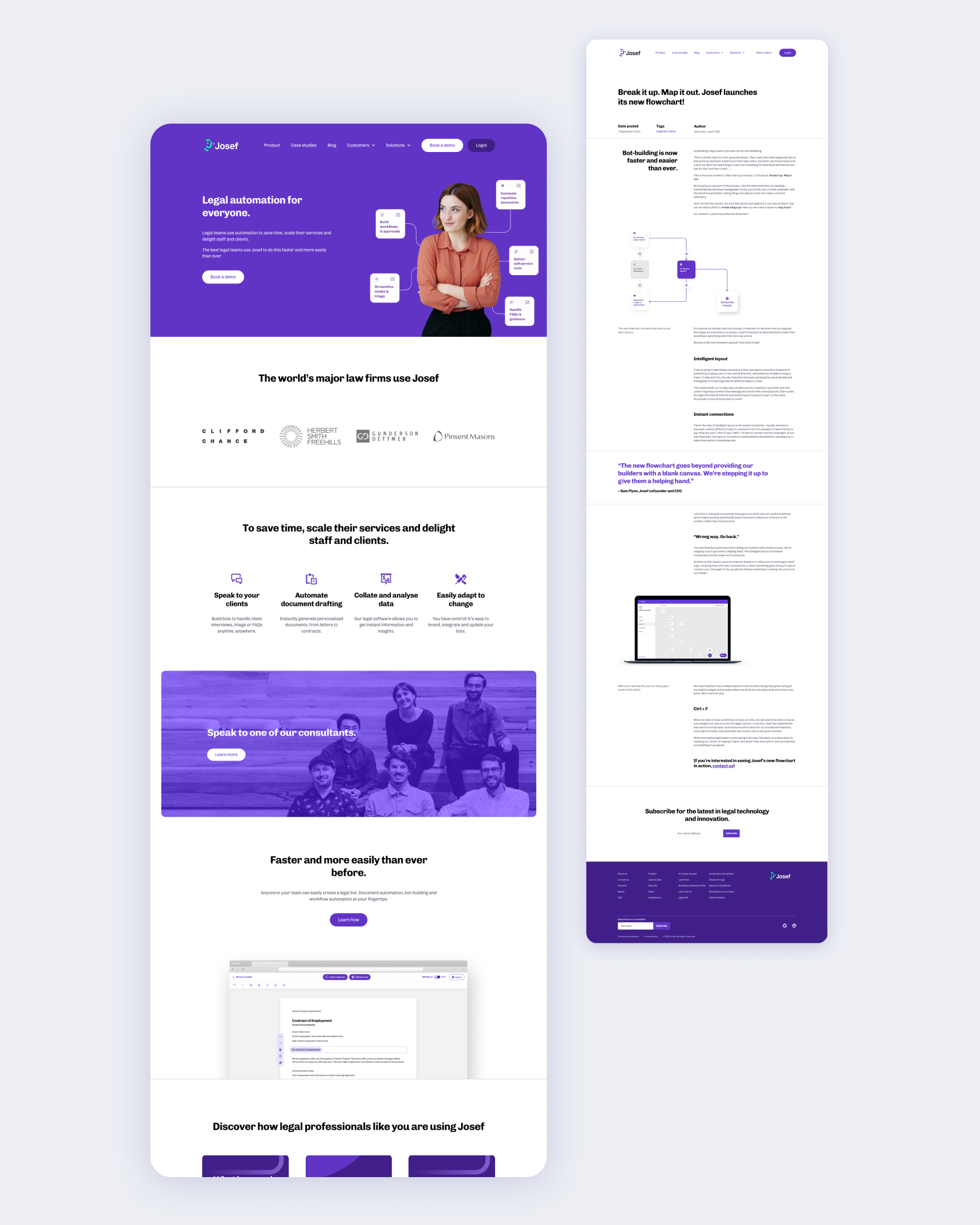
As Josef grew, the marketing website needed to better reflect the product and communicate a more complex offering.
I worked with the team to rethink the structure of the site, including the information architecture, content, and overall flow. A big part of this was simplifying how the product was explained and making it easier for different types of users to navigate.
From there, I designed the layouts and components, defining the visual direction through typography, colour, and page structure. I worked closely with developers to bring everything together and ensure the site worked well across different devices.
The redesigned site made the product easier to understand and gave the team a clearer foundation to build on as things continued to evolve.
I worked in a small team, collaborating closely with engineers, product, and other stakeholders across the business.
The problems we were solving were often not clearly defined, so a big part of my role was breaking them down and figuring out how they should work before designing solutions.
I worked quite autonomously, but regularly shared work, explained my thinking, and aligned with others on decisions, especially where there were trade-offs between usability and technical constraints. The pace of the team also meant adapting quickly and working across different areas when needed.

