I worked at Ziplet for five years as a product designer, working across the product as it grew over time.
Ziplet is a feedback tool used by schools to gather student responses and help teachers reflect on their lessons. A lot of my work focused on improving how teachers create, review, and make sense of feedback, especially in areas where things started to break down or became harder to use at scale.

Over time, I worked across different parts of the product, including:
A lot of this work focused on bringing more structure and clarity, especially as the product grew.

A closer look at a couple of projects:

At Ziplet, asking questions was a core part of the product. Teachers used it regularly to collect feedback from students, often as part of their day-to-day teaching.
The existing flow worked for simple, one-off questions, but started to break down for teachers who were planning ahead or managing multiple classes.
Through surveys and user interviews with teachers, a few consistent issues came up:
Teachers often mentioned they were creating questions in between lessons or while students were settling into class, which made the process feel rushed and inconsistent. There was no way to properly organise questions in advance, so everything had to be created in the moment, adding friction to regular use.
The challenge was expanding the feature without making it feel heavy.
Teachers needed more control, like scheduling and reusing questions, but the product still needed to feel quick and easy to use. Adding more functionality risked overcomplicating something that was previously quite lightweight.
The goal was to make it feel quick and easy to use, while supporting more structured use over time.
Rather than replacing the existing flow, I focused on extending it to support planning and organisation.
This led to introducing a set of features that worked together:
The idea was that this would fit into how teachers already work, especially for those planning ahead or managing multiple classes.
One of the main decisions was how much functionality to surface upfront.
We could have exposed everything at once, but that would have made the flow more complex. Instead, I kept the primary experience simple, with more advanced options available when needed.
Another trade-off was around visual density. Supporting scheduling and repeating added complexity to how questions behave over time, so it was important to make those states clear without overwhelming the interface.
I worked closely with engineers to define how scheduling and repeating logic would work, especially around edge cases like overlapping timings or updates to live questions.
The updated flow made it easier for teachers to plan ahead and manage their questions.
Instead of creating questions in the moment, teachers could schedule and organise them in advance. This reduced friction for regular use, supported teachers who were short on time, and helped move the product towards more consistent usage over time.
This gave teachers more control over how they run their classes, rather than relying on creating questions manually.
It also contributed to improving user retention, as teachers were able to use the product more consistently over time.
This project made it really clear how much time affects how something gets used.
It’s easy to improve a feature, but if it still takes too long, people just won’t use it.

Ziplet is used across different age groups, but much of the existing experience assumed that students could create accounts and access the product independently.
This started to break down in classrooms with younger students.
Teachers were running sessions where students either didn’t have their own devices, struggled with signing up, or weren’t allowed to create accounts due to school consent requirements.
In some classrooms, a large part of the lesson would be spent helping students sign up or log in before they could even start. In some cases, this meant teachers avoided using the product altogether in those contexts.
The core issue wasn’t just simplifying a flow, it was rethinking access to the product.
Removing the need for accounts made things easier in the moment, but introduced questions around how students join, how responses are tracked, and how sessions are managed.
There was also a need to design something that worked well for younger students, keeping the experience simple and easy to follow without losing clarity.
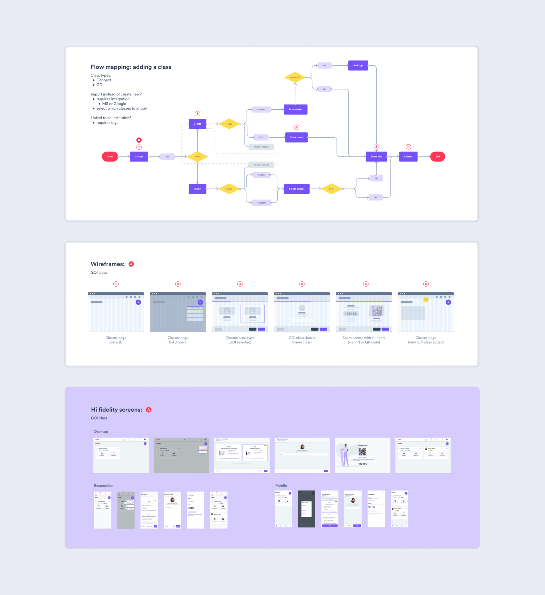
I worked on introducing a new class type, GO! Classes, designed specifically for these scenarios.
The key idea was to allow students to join using a simple PIN instead of creating an account.
Alongside this, I designed a simplified student-facing version of the app tailored to this flow, reducing friction at the point of entry and making it easy for students to participate.
This involved:
One of the main trade-offs was between ease of access and structure.
Removing accounts made it much quicker for students to join, but reduced the ability to track individuals over time. The focus was on supporting the immediate classroom experience, even if it meant giving up some longer-term tracking.
Another decision was how much to simplify the student interface. It needed to be easy to use for younger students, while still feeling consistent with the rest of the product.
I worked closely with engineers to define how the PIN system would work and how sessions would be managed without user accounts, including handling edge cases like multiple students joining at once.
GO! Classes made it possible for teachers to run sessions in classrooms where the product previously didn’t work well.
Students could join quickly using a PIN, without needing accounts, which reduced setup time and made sessions easier to run. It supported younger students and allowed Ziplet to be used in a wider range of classroom settings.
This project made me rethink some of the assumptions we had around accounts and access.
Once those were removed, the product worked in situations it just didn’t before.

I led the implementation of a full company rebrand, including a new identity and name change.
I expanded the initial style direction into a more complete and usable system, updating existing collateral across the business and creating new assets to support the rollout.
As part of this, I introduced Figma across the company and built Ziplet’s first design system and component library. This involved migrating existing designs, standardising components, and updating product screens across web and mobile.
The goal was to create a more consistent and scalable foundation as the product grew. I also maintained the system over time, refining components and supporting new features as they were introduced.
Beyond the product, I used Figma to organise shared resources and establish a single source of truth across teams. I also supported adoption by helping team members understand how to use it in their day-to-day work.

I designed several versions of the marketing website over time, with the most recent being a full redesign and rebuild as part of the company rebrand.
I worked closely with the Growth and Marketing teams to rethink the structure of the site and define a clearer information architecture. From there, I designed the components, page layouts, and supporting assets.
I built the site in Webflow, making sure it worked well across different screen sizes, and was also responsible for maintaining and updating it over time.


I worked in a small team, collaborating closely with engineers, product, as well as marketing and sales.
Because of the team size, I had a high level of ownership across projects. I was involved from early exploration through to implementation, shaping both the direction and the detail.
The nature of the team also meant switching context quickly and adapting as priorities changed. Alongside product work, I built and maintained the design system and helped ensure consistency across the product, marketing, and website, drawing on my background in brand design.

